Empowering people to develop long-lasting healthy nutrition habits.

Description
OME Health is a 12 week personalised nutrition coaching programme that helps people to develop long-lasting nutrition habits tailored to their health goals, whether it be losing weight, improving your energy or wanting to improve the quality of your diet.
I joined the team in August 2018 after their seed round funding stage, as their first design hire to lead the user experience across their iOS and Android products whilst the business moves towards Series A. Working in a close-knit team with both co-founders (CEO and Head of Science), Product Manager and Nutrition Scientist / Health Coach.
To comply with my non-disclosure agreement for OME Health, I have omitted and obfuscated certain visual and written information which is confidential within this case study.
The Challenge
✨ Empower people to develop long-lasting healthy nutrition habits.
In a sea of overwhelming advice inside the health and nutrition market, our goal was to cut through the ambiguity and confusion people are faced with when making nutrition decisions to develop a product that empowers them to make better and healthier choices inline with their personal health goals. Backed by solid scientific evidence based testing, our product analyses your blood, microbiome (gut health), DNA and lifestyle data, to provide recommendations which are truly personalised.
Ambiguity and overwhelming misconceptions
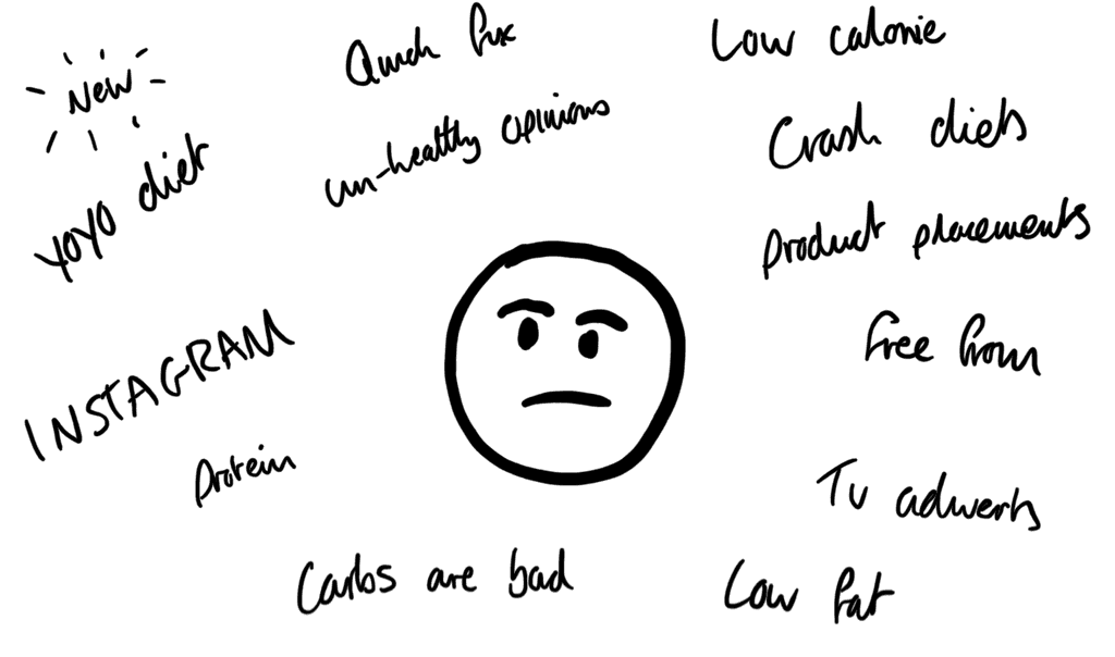
When people generally want to make better informed nutritional decisions, they often rely heavily on research that they'll perform themselves online, or go to friends and family for ideas on how to change their diet, but unfortunately this can lead to many misconceptions.
Online they're intrusively force-fed advice from endless articles that continue to saturate the market with ill-advised recommendations that didn't originate from a health professional.
This aspect of influence has only shortened the timeframe of expectation in change that people believe and are motivated by, fuelled through a slew of opinions such as 'crash diets', 'YoYo diets' and 'quick fixes' proclaiming that all you need to do is make a few small adjustments to your lifestyle and all your idealistic health changes will quickly fall into place. This is also overshadowed with 'weight loss foods' that you can't miss and fallacies such as 'carbs are bad' and 'fat is fat' that build up a persuasive environment full of misconceptions... it's no wonder how hard it is to really know what's personally good or bad for you.
The solution
OME Health is designed to take an array of information (blood, microbiome, DNA and lifestyle data) and analyse it to create personalised weekly goals and meal suggestions which help you develop and work towards better nutritional habits over the course of 12 weeks.
Examples of the OME Health app when i joined the project. Views: Goals, Progress and Goal details.

Kicking off with key insights
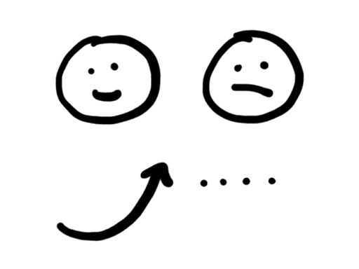
If users don't see personal progress quickly in relation to their health goals, they're more likely to lose motivation.
With little qualitative or quantitative data to hand regarding the user experience at the time, we wanted to understand more about the potential challenges and problems users faced when using the product for the first time. We were partially interested in understanding further information around how users completed their personalised weekly goals and the efforts associated with them in relation to their perspective of progress. Myself and my product manager set up interviews with target users to closer look at these aspects.
By combining this information with initial market research that was undertaken just shortly before I joined the team (thanks to our amazing PM Ieva Lekaviciute 👏) we discovered that one of the biggest barriers to making nutrition changes is that if users don't see personal progress quickly in relation to their health goals, they're more likely to lose motivation and in the worse case potentially give up.
Further initial findings
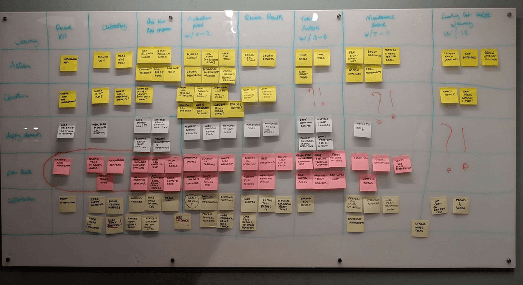
Early stage journey map
When people generally want to make better informed nutritional decisions, they often rely heavily on research that they'll perform themselves online, or go to friends and family for ideas on how to change their diet, but unfortunately this can lead to many misconceptions.
Online they're intrusively force-fed advice from endless articles that continue to saturate the market with ill-advised recommendations that didn't originate from a health professional.
This aspect of influence has only shortened the timeframe of expectation in change that people believe and are motivated by, fuelled through a slew of opinions such as 'crash diets', 'YoYo diets' and 'quick fixes' proclaiming that all you need to do is make a few small adjustments to your lifestyle and all your idealistic health changes will quickly fall into place. This is also overshadowed with 'weight loss foods' that you can't miss and fallacies such as 'carbs are bad' and 'fat is fat' that build up a persuasive environment full of misconceptions... it's no wonder how hard it is to really know what's personally good or bad for you.
High effort, low gain
We discovered that the first time experience needs to be refined. We don't meet the expectations users are looking for when they've gone to the high effort of signing up, filling out a long and detailed lifestyle questionnaire and completing their health tests before using the product.
How am I doing?
We also uncovered that understanding whether you're making progress is a little underwhelming. It's hard to gauge the wider perspective of how you're performing within your health journey and if you're on the right track towards success.
Deeper understanding, what is progress?
First we needed to understand what 'progress' really means to someone. As a product we offer four routes when starting your health journey to help put you on the right track towards your intrinsic motivations: Lose Weight, Improve Energy, Eat Healthier and Improve Heart Health.
We know that the majority of intentions when it comes to making health or nutritional changes to your lifestyle come down to weight loss. From our research, 60% of users confirmed that losing weight was among their most important health goals. So to stay agile in developing our user model, we decided to focus on learning more about this motivation.
Progress = working towards your deeply personal, core values
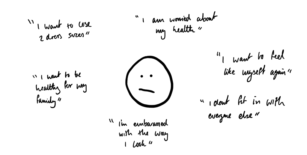
From our findings we learnt that when someone decided to select 'Weight Loss' within our product, it doesn't directly mean that it's their core intention within improving their health. 'Weight loss' is the overarching mask and driver of their personal and inner core values for change.
For instance, when interviewing users and getting down to the real reasons for change, we found that there were an array of responses which didn't truly correlate with just losing weight alone.
Many reported that their real reason for making lifestyle changes were:
Working towards core values = positive behaviour change
Our value proposition focuses on helping people change their pre-programmed processes (aka Habits), so that in turn they replace their old habits with new ones, which over time will drive better pre-programmed decisions so that they can change their behaviour for the long-term.
James Clear (the author of Atomic Habits) brilliantly states that:
"Behaviour that is incongruent with the self will not last… True behaviour change is identity change."
Understanding these key insights in addition to our two main initial findings begs the question,
How might we design an experience which sets someone up for success and helps them to holistically understand their progress along the way?
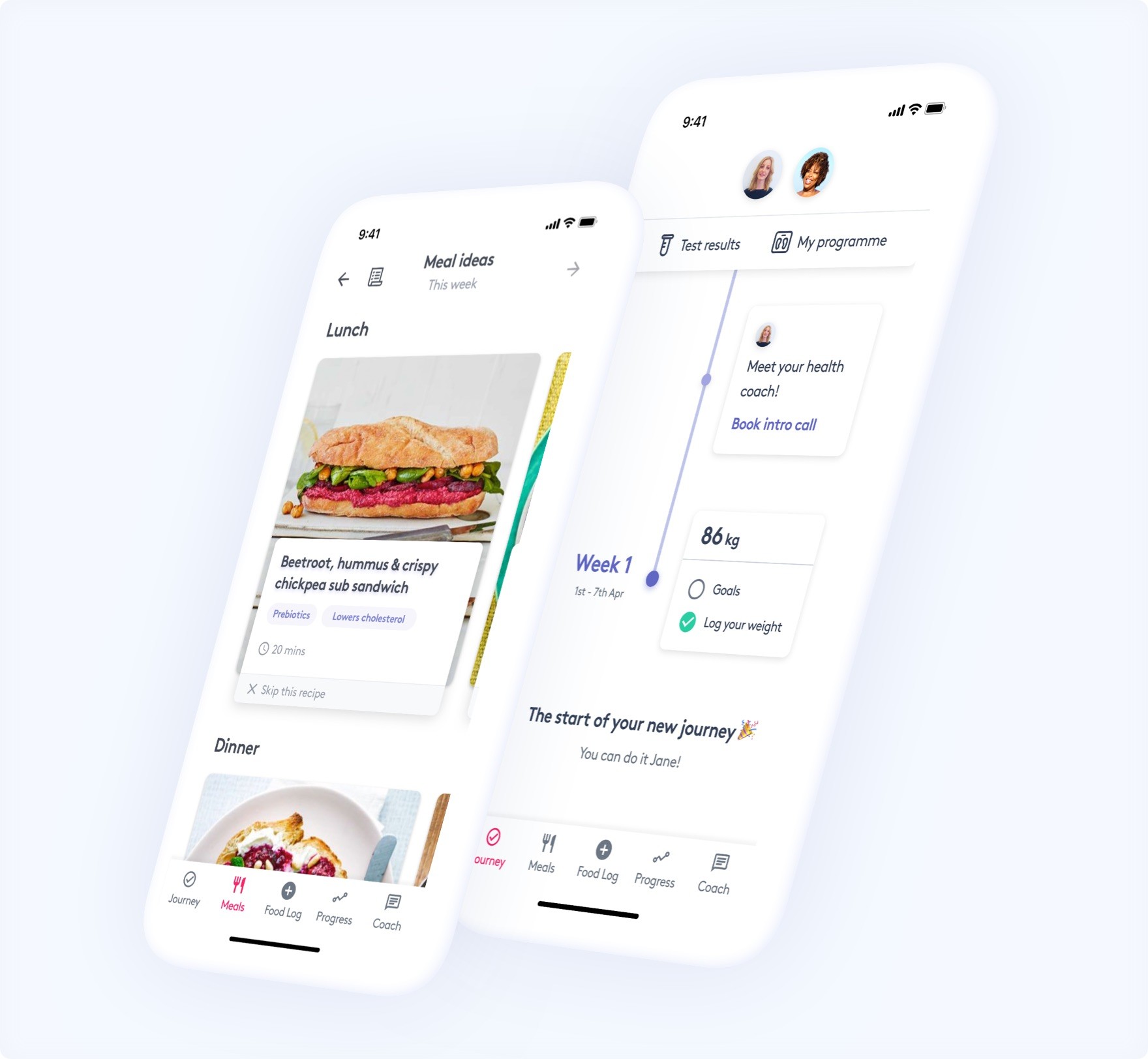
Introducing, a new onboarding experience and 'Journey' tab.
✨ Improved user onboarding
Start your new health journey feeling empowered for success
Examples cherrypicked from the onboarding process. Note: For users, onboarding shouldn't just be the screens that remind you of the primary features they've partially witnessed after downloading an app. Fully onboarding a user into your product means thinking about their experience weeks after they use it for the first time.
✨ The Journey tab
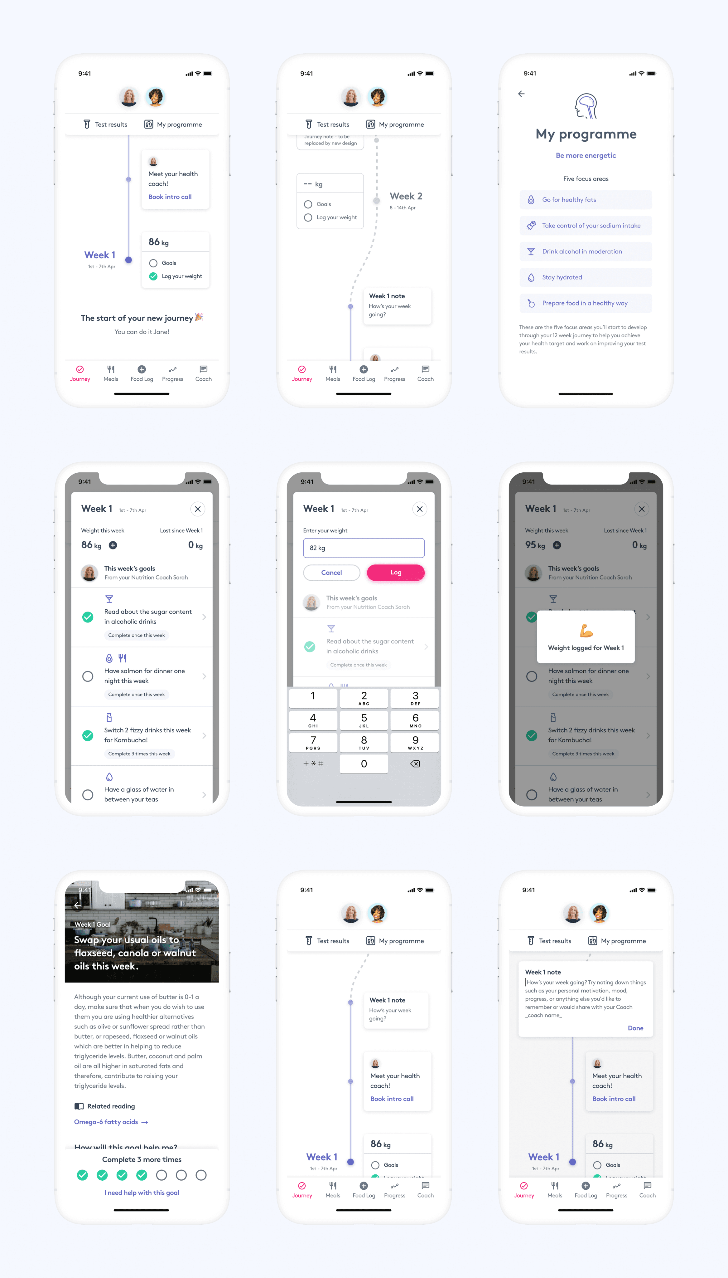
A new information structure to replace the pre-existing weekly goals design to provide you with the whole perspective of your health journey.
Examples cherrypicked from the onboarding process. Note: For users, onboarding shouldn't just be the screens that remind you of the primary features they've partially witnessed after downloading an app. Fully onboarding a user into your product means thinking about their experience weeks after they use it for the first time.
✨ Better user onboarding - how did we get here?
After interviewing with an array of current users and people who had never seen the product before, it became clear that there were several issues with the current user experience which manufactured this 'high effort, low gain' problem I spoke about earlier. This also developed symptoms that lacked guidance when signing up, leaving many experience segments ambiguous, and provided uncertainty around what their next steps are after they're ready to get going in the app itself.
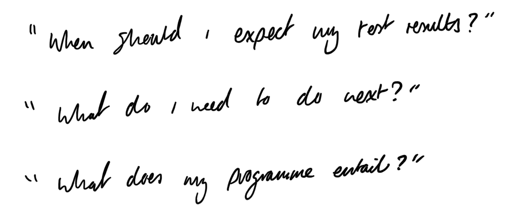
One overarching issue with the current model, is how a user receives their test results a week or two after opening and using the app with it's main features for the first time. Performing a health test is deeply personal to people and therefore the expectation of its data and advisory results supersedes all other interest in the app until their test results are ready.
With our problems defined, we set out to create solutions based on the following goals:
Set users up for success by putting all information in place before their journey is ready, for instance, by designing a flow which waits until all their test results are ready before allowing them to use the product.
Create an onboarding experience which is guiding, progressive and makes it easy for new users to feel empowered whilst they learn how to move forward.
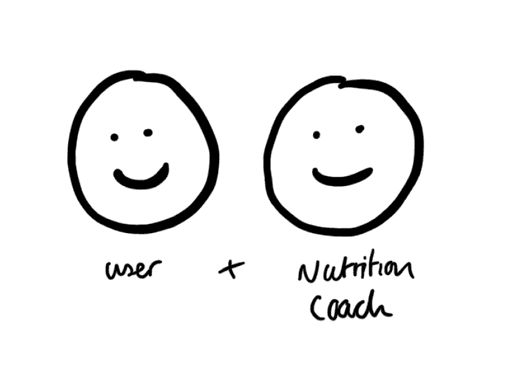
"You feel that somebody is batting for you"
During our early research phase of this feature, our brilliant Nutrition Scientist and Health Coach Sarah Brown highlighted something which really struck a chord with me and ingrained into my mind throughout the entire design process. She shared a quote from a study looking at identifying pathways to effectiveness in weight loss management programme.
This identified that when you have a good quality relationship with your health coach throughout your journey, it can lead to much better support for the user. "You feel that somebody is batting for you". This quote turned into our 'Coaching' principle which overlaid a majority of my design thinking.
One simple yet incredibly effective behavioural technique to employ this was to position the user's profile alongside the coach when entering the core part of the app, to signify that this is a 1:1 relationship and your nutrition coach has got your back. This also plays into the user's social biases, by aiming to please their coach and make positive progress, which is a great subtle motivator to help the user get on track towards a positive health outcome.
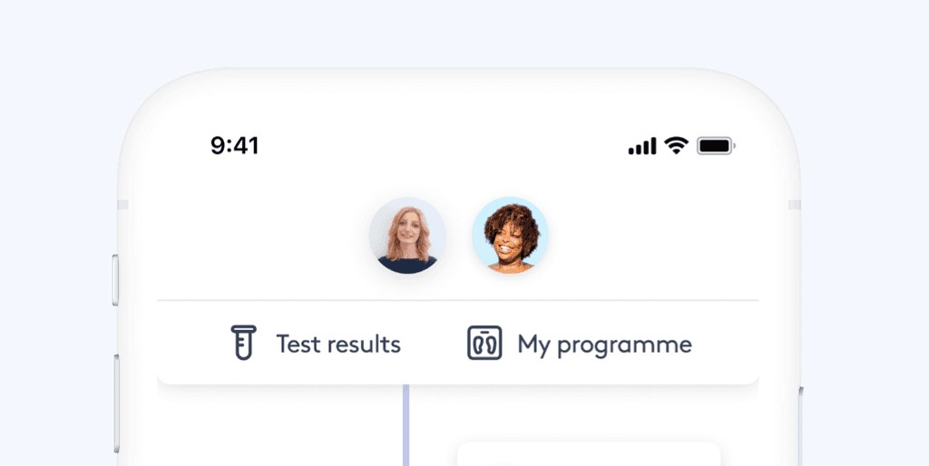

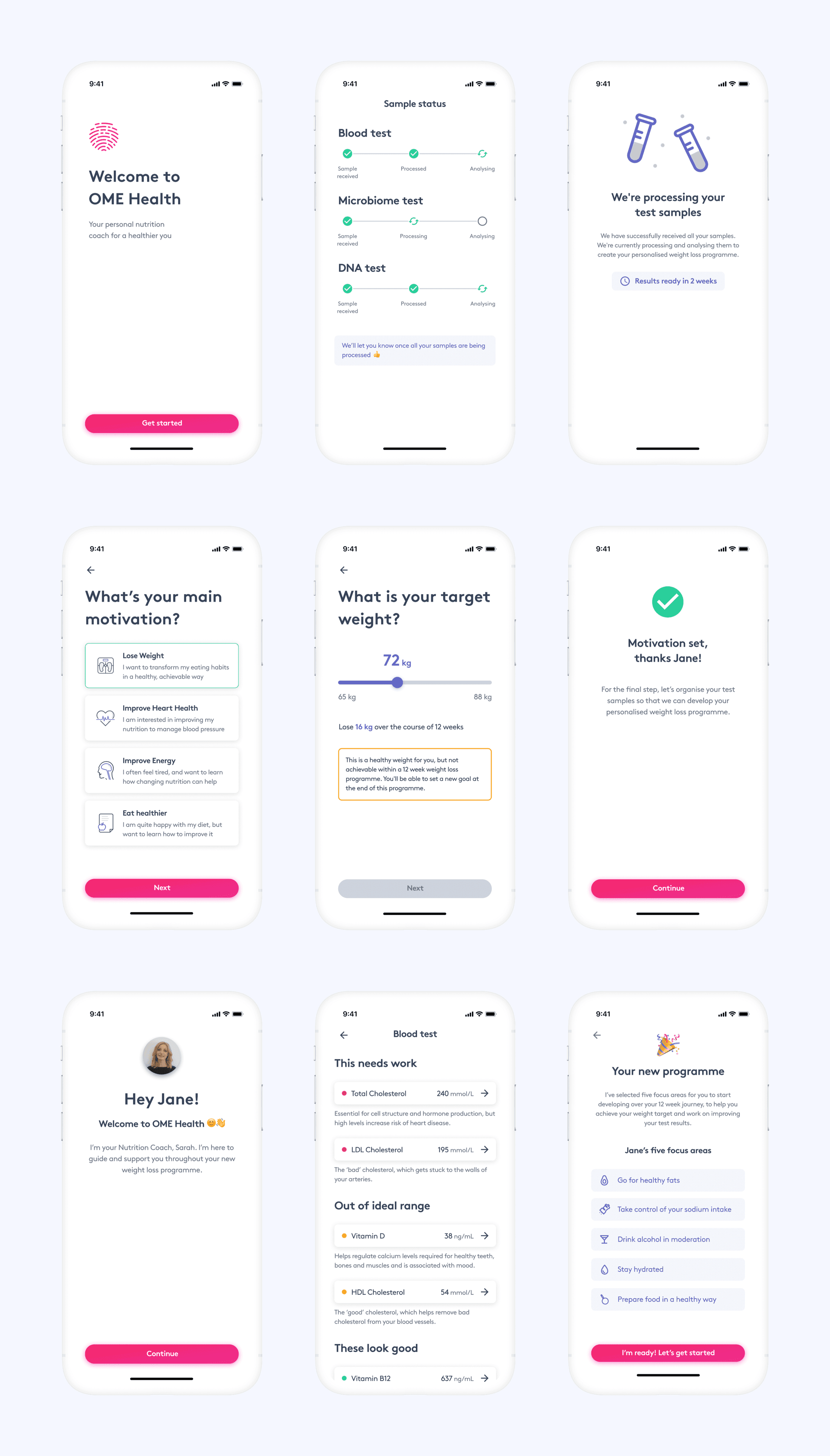
An example of the 'Programme summary' we designed for users when their test results are ready, to help set them up for success more effectively. By also introducing their dedicated nutrition coach early in the experience, we are further developing a 1:1 connection between them and the user to enforce a supportive relationship.
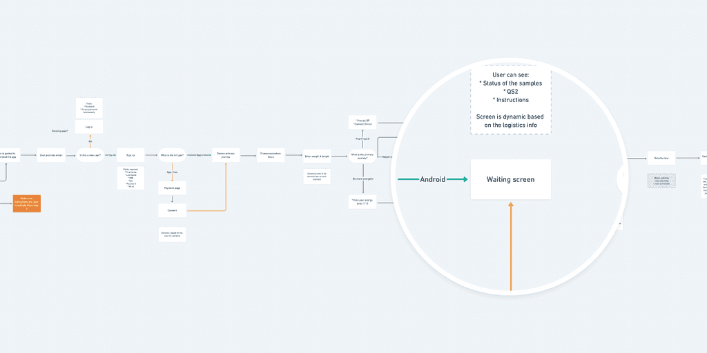
Example of our the new high level onboarding flow
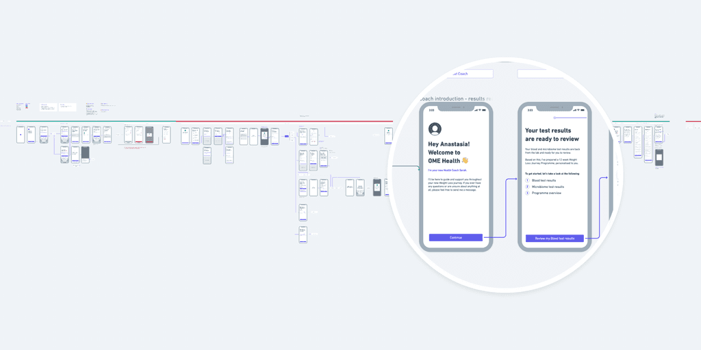
Example of the wireframe flow, and meeting your health coach for the first time before getting into using the core app.
We show users their test results early to allow them to 'Trip over the truth'. Some results they discover may instigate high emotions if they are outside of their expectation - we comfort them in the following screen with a new framework we created called 'Focus areas'. These are long-term behaviours that work towards improving your test results and your intrinsic motivations over the course of 12 weeks of the user's programme, based from OME Health's analysis.

Examples of various screens in the onboarding process which promote qualities of support and guidance. Our aim in the final design was to mitigate any ambiguity and always provide clarity in core use cases e.g. expectation around your test results, providing professional and supportive feedback on your weight goals or the new framework we've created that provides you with five focus areas to work towards to achieve your long-term goals.
The delivery
I split regions of the onboarding experience into phased segments. That way we could stay agile in validating the UX with users and deliver the experience more efficiently to stay inline with business objectives.
✨ The Journey tab - show me the whole picture
When designing the new Journey tab, we knew from initial research that if users don't see personal progress quickly in relation to their health goals, they're more likely to lose motivation.
This hypothesis was validated for us in our interviews when we confirmed that people had a hard time grasping the bigger perspective of their health journey, with a design so focused on the current week itself: it's hard to see where you started, how you're doing now and what your future looks like in conjunction with the core values propelling your motivation.
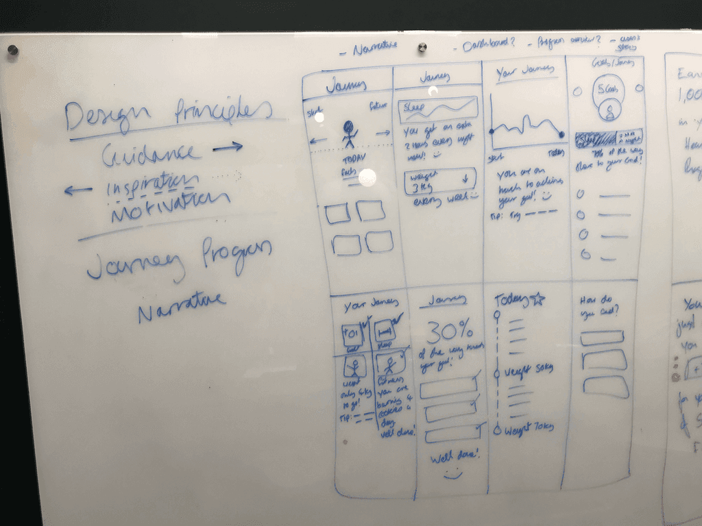
I created three UX principles and questions to help explore ideas as part of my design strategy.
UX Principles
UX Questions
Where am I in my Health Journey? (UX Principle = Guidance)
Have I moved forward successfully? What have I accomplished? What have I learned? (UX Principles = Inspiration + acknowledgement)
What do I need to do to improve? (UX Principle = Guidance + Inspiration)
Contexts and aspects
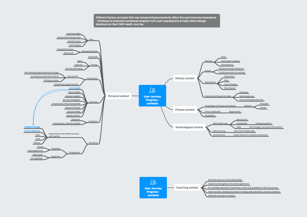
To help further inform my design decisions, I mapped our various aspects and contexts that affect the problems and challenges users may face in their own environments, in an effort to further progress our user model on top of the analysis we already had.
The solution
I decided to run a workshop involving the whole team early on in the design process, leading the experience in a small team means communication is one of your advantages.
I wanted everyone to understand what we were designing towards as a foundation of this project and allow us to benefit from the diversity of our team. We performed a crazy 8s exercise to rapidly come up with new ideas regarding the problem of displaying progress and perspective to the user. I also believe one of the characteristics of a great designer is to aim to employ a culture of creative collaboration, by leading your team to design great products, not just yourself.
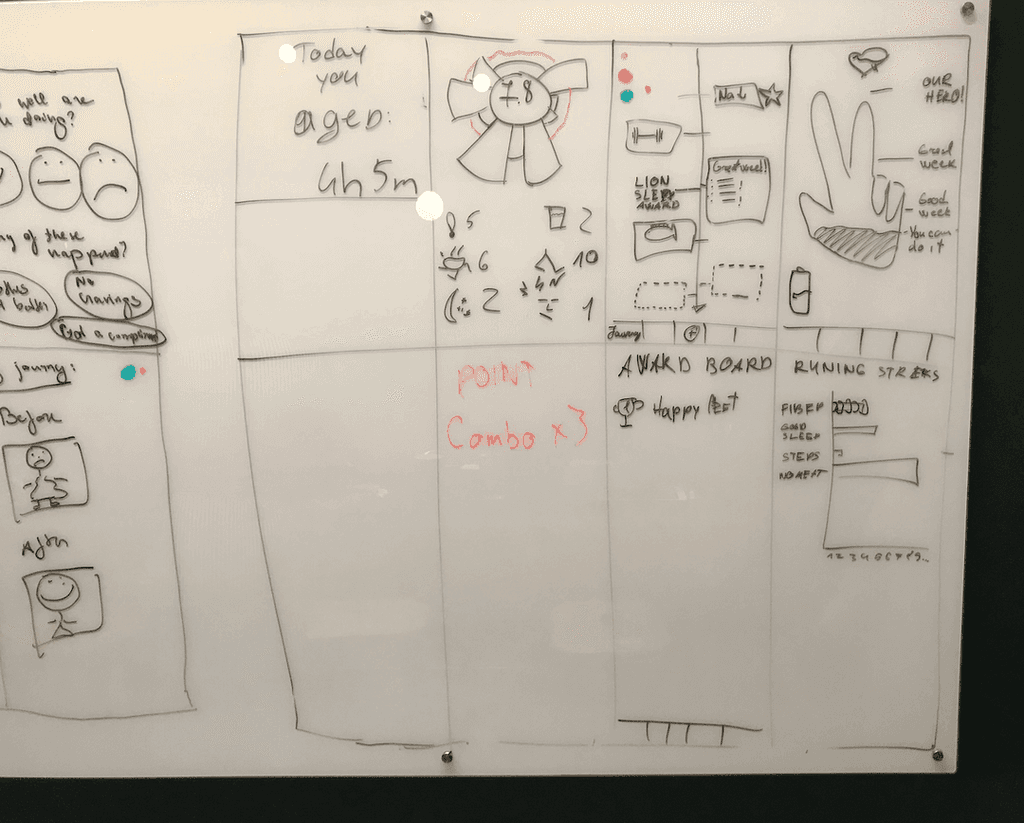
Utilitarian, or Holistic?
Early ideas from research, creative collaboration and wireframing suggested that a new model of information was needed in the design.
I designed a 'timeline' structure, in comparison to the current list model that houses a user's personalised weekly goals. This means that a user has a full view of their health journey, not just the specific tasks suggested for them. After diverging into different ideas during the wireframing phase, I settled on validating a Utilitarian design to model this timeline structure and a Holistic design to break the familiarity and push it into a new hierarchy.

Utilitarian Design
Prioritises quicker access to the weekly data over the entire journey.

Holistic Design
Prioritises the entire journey over weekly information (With the ability to dive deeper).
Early ideas from research, creative collaboration and wireframing suggested that a new model of information was needed in the design.
I designed a 'timeline' structure, in comparison to the current list model that houses a user's personalised weekly goals. This means that a user has a full view of their health journey, not just the specific tasks suggested for them. After diverging into different ideas during the wireframing phase, I settled on validating a Utilitarian design to model this timeline structure and a Holistic design to break the familiarity and push it into a new hierarchy.
From weekly goals to your Journey
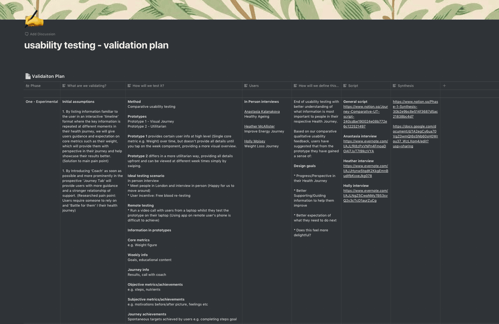
As this is a large change to the architecture of the product, I decided to create a validation strategy which allows us to test various regions of the experience from a wider angle and then zooming into the smaller details down the line, this developed over the course of six phases. As we are a small team, sharing this document is integral to keep them in the loop regarding what we are keen to learn, how we're testing it, who with, and what we synthesised.
After finalising user flows and learnings from usability testing, I decided on the following three goals for the design to accomplish and for us to measure by, to truly provide a sense of progress and perspective for our users:
Empower users to understand the contrast between what being on track looks like, vs being off track so that they are able to figure out what to do next to continue working towards their personal motivations.
👀 Provide the whole picture
Ensure that the design provides users with a clear idea of how they are doing in their entire programme, vs how they are performing on a weekly basis.
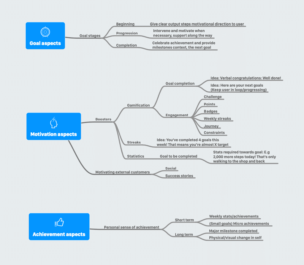
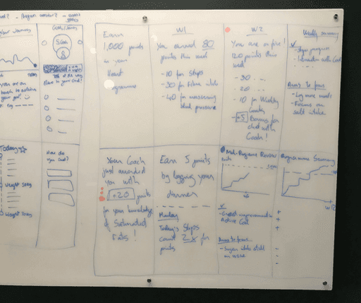
🎉 Commemorate milestones
When possible, strategically surprise people with positive affirmations for when they achieve their goals or certain journey milestones so that we can help them stay on track to make progress.
Summary
I'm extremely proud of the work our team has achieved in such a short period of time, I'm proud of our external dev team which made this product become a reality and I can't wait to see how OME Health grows in the future, and how this drives the future of nutrition.
Thanks for reading 👋