Evolving a simple IOT proposition into a smart home ecosystem.
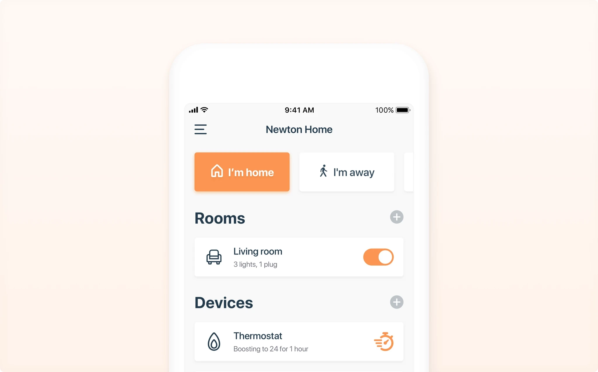
Description
How a simple smart home proposition by British gas evolved into an ecosystem of products for the home, that needed to refine and adapt its UX for their growing lifestyle customers.
For customers of the smart home/life economy, it's already becoming saturated with endlessly growing choices of which product to choose from to install in your home. Hive's value proposition is an interesting hybrid mix of a pill solution that makes controlling your home in everyday life easier, more effortless and more enjoyable, but also provides customers with a seed product experience which allows them to do much more than just control the basics in a smart way.
Hive began as a heating and hot water smart home proposition, and began to grow into an ecosystem of products that progressed to interface from motion sensors to cameras. However, the user experience in their app hadn't adapted to accommodate this growth in product. The Home view 'Honeycomb' now served as a remote area to control these products separately, splicing features of each smart home device into their own sections, instead of providing users with a synchronised and centralised experience.

Screenshot of Hive's 'Honeycomb' home view when i started working on the project.
✨ Research and conceptualise a new IA prioritised in hierarchy by user needs.
Working alongside another dedicated user researcher, I led the UX design, IA mapping, wireframing, prototyping and a joint effort of validating our work together. As well as supporting the wider design team with upcoming product feature development and tidying up various design patterns.
My design strategy
Action plan
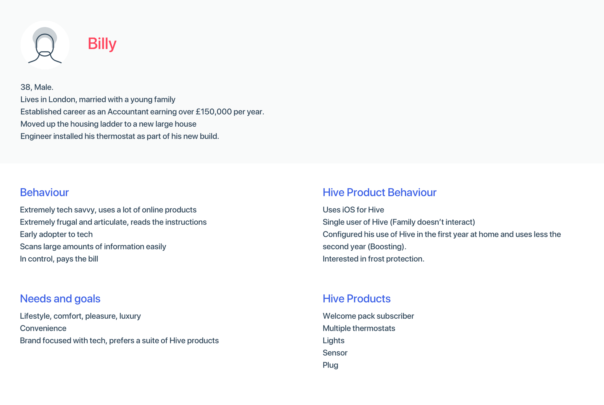
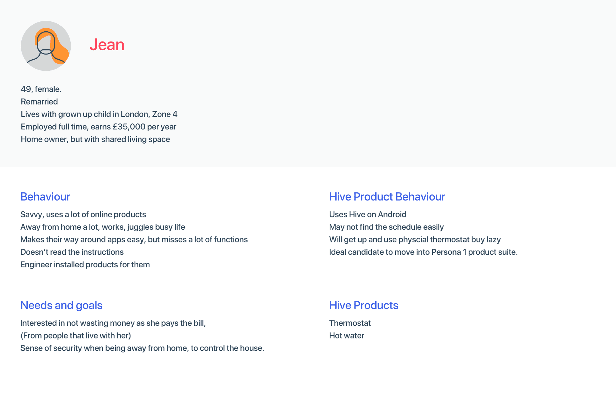
Research and draft provisional personas to develop the teams user model, to be refined in future testing.
Research and understand current pain points with users operating their smart products across the home, collectively and singularly.
Define and prioritise user needs.
Review these prioritised user needs against the current architecture.
Sketch and create prototypes to test and validate those assumed needs.
Research
Personas
To kick off this project we created two new provisional personas to help guide our immediate design decisions and research goals. They were both based on a mix of my knowledge being a hive customer myself with friends that also use hive, alongside researching online through relative data I could collect, including reviews from the App Store, and customer usability interviews previously conducted.
Identify and prioritise needs
We wanted to understand how each product was being used, and compare that with when and how much time was spent by users amending or accessing these devices, to build a collective understanding of how they controlled their home.
We recorded a lot of qualitative information from users which provided us with the following pain points and further information on how customers used their products.
We also began to gain a lot more information about each product and throughout our research it became clear that there were three levels of interaction type. We categorised them into a hierarchy to generalise how much time users spent controlling them, and how often they spent amending the controls.
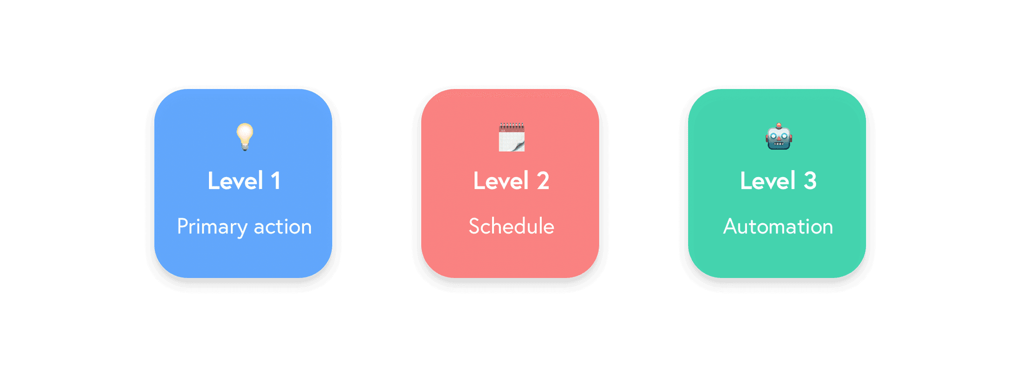
1. Primary device function
First level of interaction almost performed daily, usually when users want to perform simple and quick situational tasks, most commonly turning a device On or Off whilst they are physically in the same room as the device, such as light bulbs or plugs.
Also used when users want to override their heating schedule and boost their heating for a short period of time.
2. Scheduling devices
3. Automating devices
Third level of interaction, this is where a user may change some custom created device to device interfaces. E.g. once a sensor detects you walk through your front door, turn light on. This can be performed every now and again.
Pain points
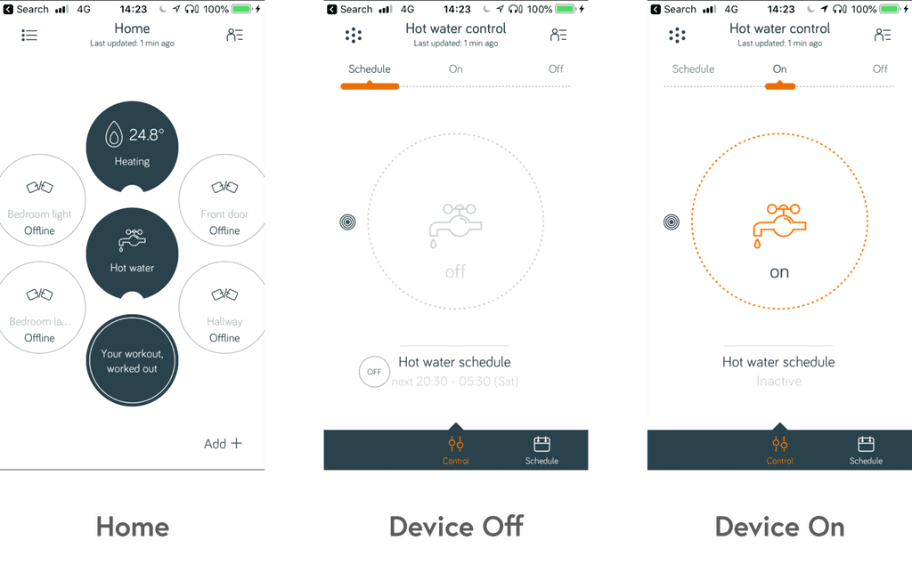
Pain point 1: It's slow and time consuming to perform quick top level actions across products.
For most of the interactions current users commit in the app, it takes a long time to perform the simple and quick tasks. Quickly turning off products is slow and long winded to perform, diving into each product takes time.
Pain point 2: Changing schedules are confusing to locate and tortuous to amend.
Aside small issues like being forced to set an 'Off' time to your schedule, which is unnecessary when users only need to be aware of when they want the device to turn On, schedule settings are confusing, some users aren't even sure where they are placed within each product, plus it's extremely time consuming to dive into each separate product to amend each individual schedule.
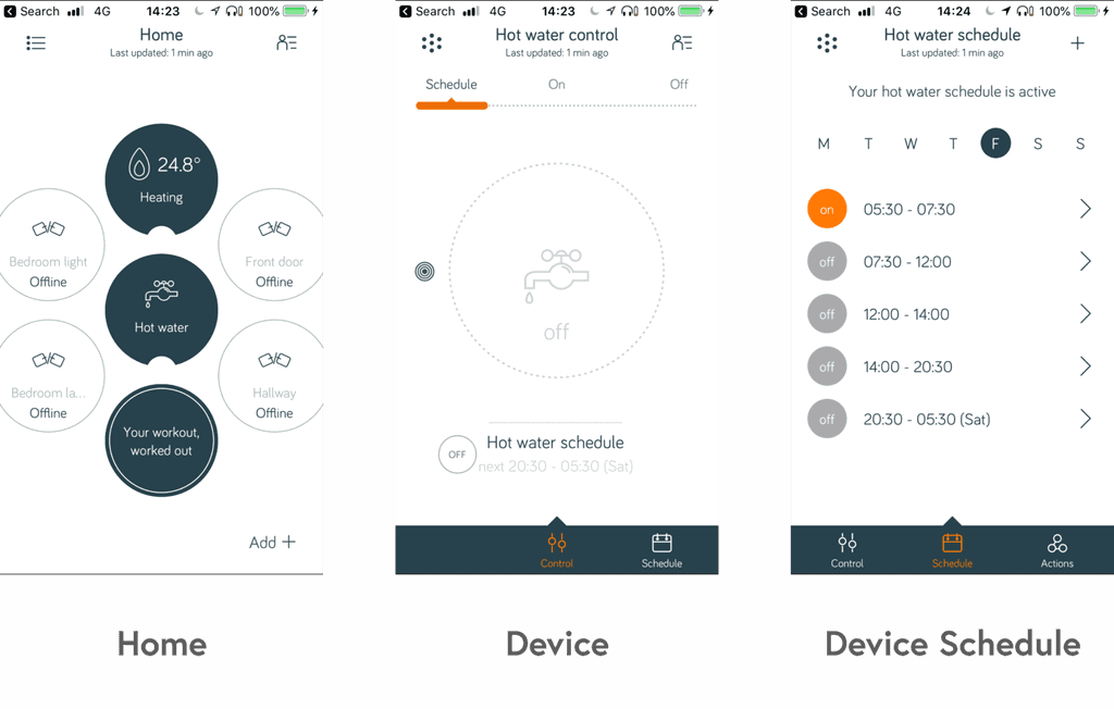
Based on the fact that you have to change each individual schedule without providing users with an a overarching view of how all schedules are operating in your home collectively, the idea of a 'Calendar' view was born.
Some controls for devices like lights or plugs commonly just wanted to be turned on or off, based on average interaction time - instead of amending secondary functions such as their colour or dim level. This can be done by tapping into the product and users felt that diving into each product to perform these simple tasks wasn't the smart app 'Smart home devices' should deliver. Neither did we.
So, how does this compare with the devices?
I then set out to collect our information and draft the top level device actions against our interaction hierarchy. We based this on Hive's currently most commonly used four smart home devices.

For now, automation interactions currently listed focus on devices working together, most commonly sensors. E.g. Turn a light on or off once a door opens or closes. This is however being tested to provide further automated preset options, such as being able to manually trigger an array of devices to perform certain actions, consolidated into one accessible button. E.g. I'm leaving home, I'm arriving home.
Defining the problems to overcome
Whilst automation is a growing and a not yet established user feature, I provisionally considered where it would fit in a future architecture and set to work on our two larger pain points.
2. Ideate
How might we change the information architecture to accommodate solutions for these two problems?
The current model doesn't allow for cross control functionality or allow users to spend less time managing each device. We'd need to conceptualise a new IA, which also allows room for new devices in the future to work together instead of in silo.
It's worth noting that this architecture was conceptualised in collaboration and agreement with the wider team whilst other designers worked on specific product needs and features such as Smart lights, we realised that controlling groups of devices needed just as much consideration as controlling specific ones. I added this consideration into the new provisional IA.
Tab bar
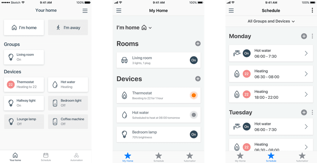
I decided to split the app into 3 new navigational tabs. Home, Schedule and Automation. This fit perfectly with the three levels of interaction we'd discovered and provided lots of opportunity to highlight top level information and actions of each product right on the home view - E.g. turning the lights on and detailing their current colour. This also conceptualises bringing Schedule out of each individual product and into a collective singular area to easily read and effortlessly amend.
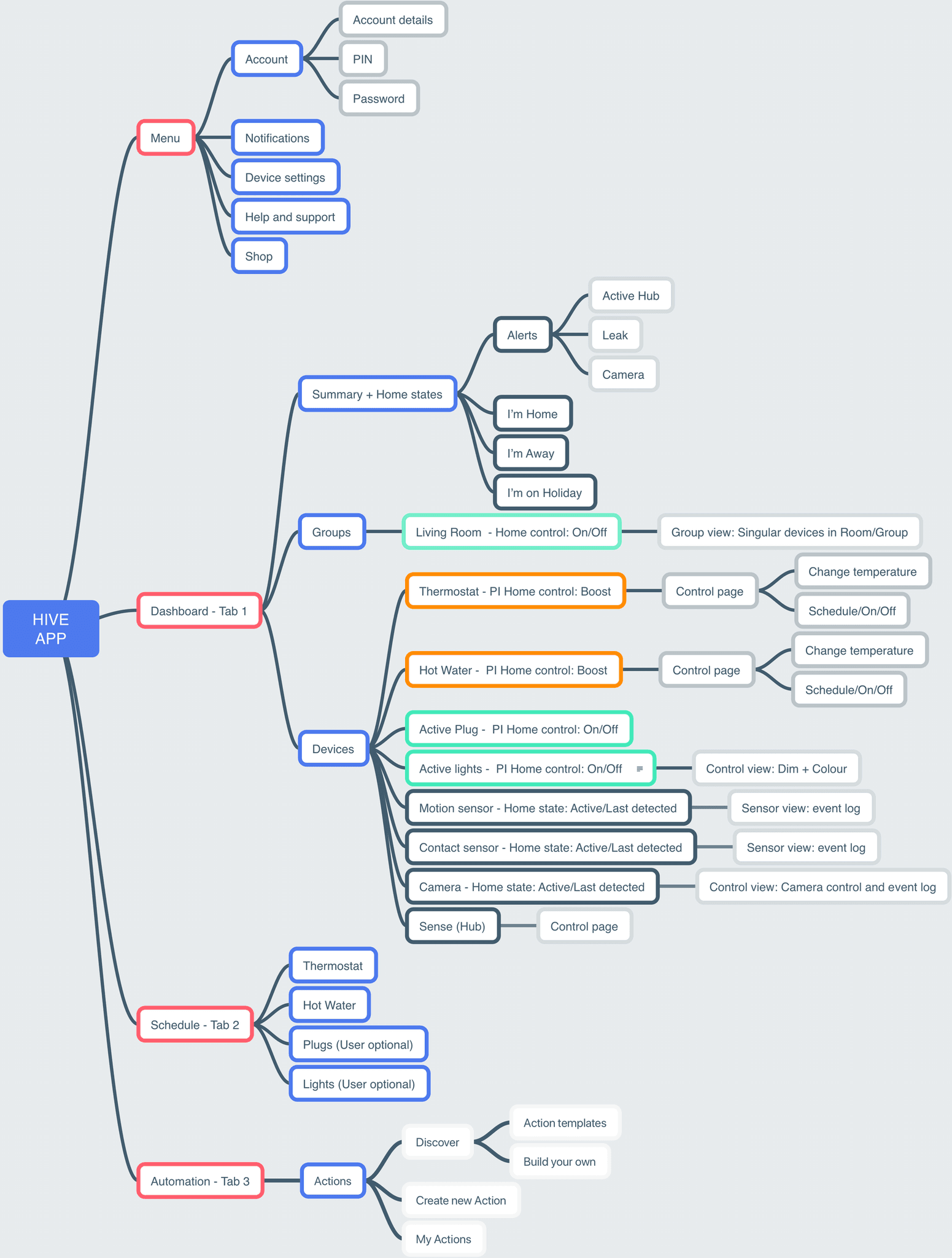
Simplified example of the new provisional architecture, highlighting top level information and actions of each product on the home tab.
Sketching ideas
Happy with the architecture I began sketching some different ways users could control the Home and Schedule.
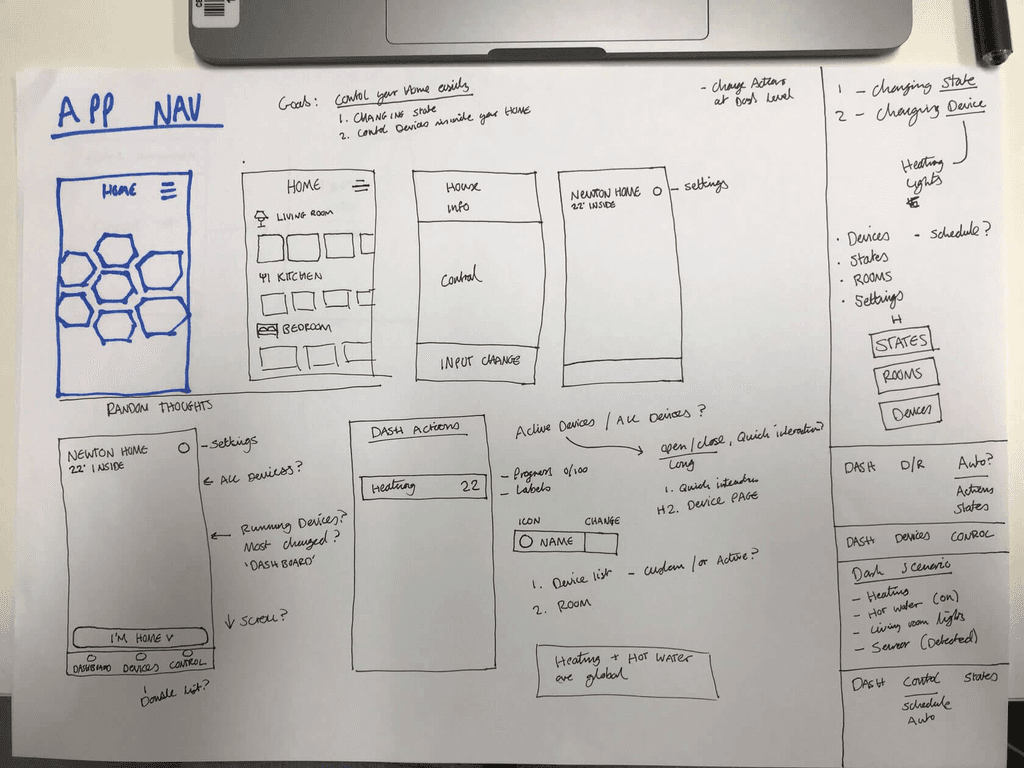
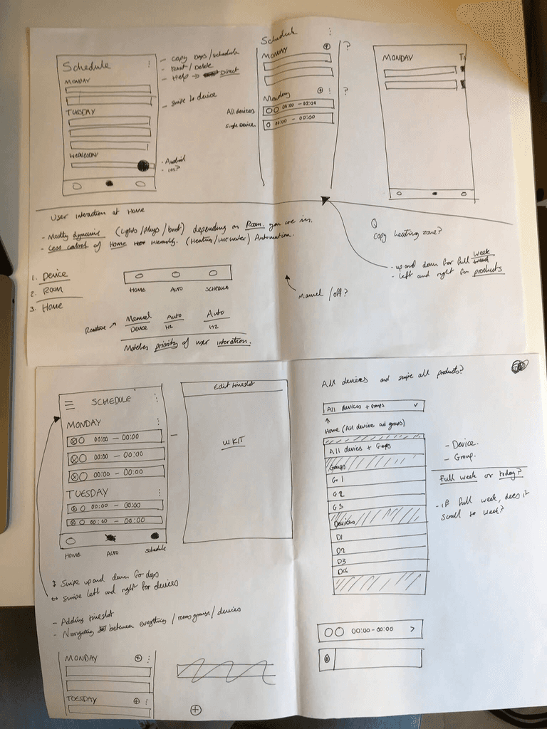
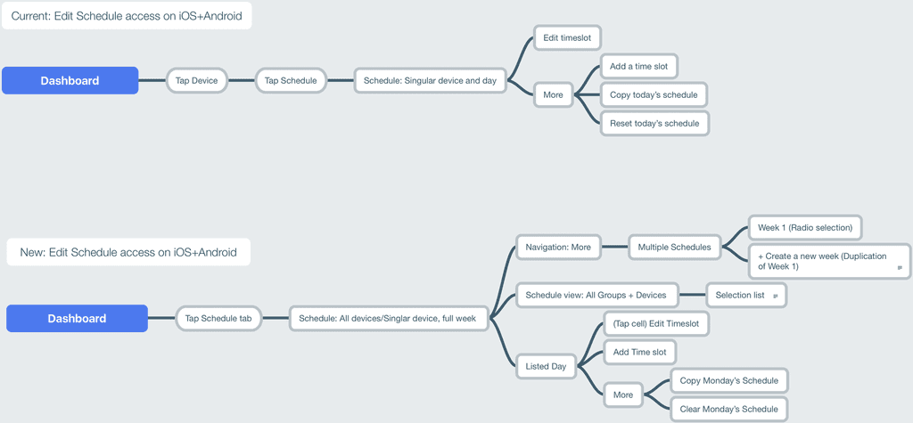
Basic flow of accessing and amending device schedules.
Wireframe examples
Happy with the architecture I began sketching some different ways users could control the Home and Schedule.
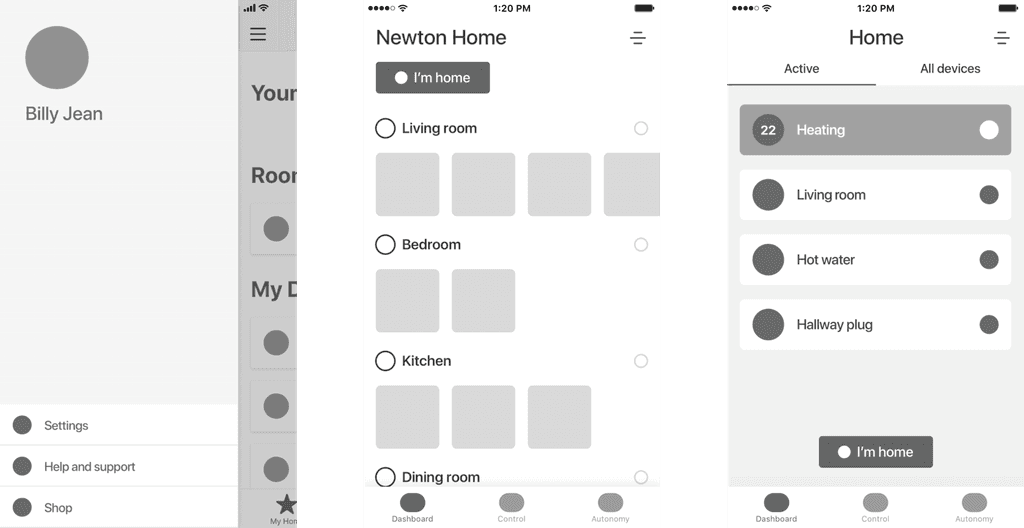
Further creative exploration
3. Prototype

I created extremely basic prototypes in principle, with some tailored to match the general device data of our testing candidates. Principle is one of my favourite design tools to test with, as I feel that it creates a real connection with the user being so fluid to touch gestures.
4. Validation and moving forward
Once our prototypes were ready to go into testing, we wanted to put it into the hands of our customers as soon as possible, thankfully we had a bi-weekly in-house testing schedule which allowed us to explore these prototypes with users quickly.
In summary, a most candidates were excited to see an app that provided shortcuts to their basic intentions of using Hive and as far as our hypothesis goes the improvements were a success. We are still prototyping and testing solutions but it's still early days - however, we're on the right track to building something that makes it easier, more effortless and more enjoyable for Hive users to control their homes with in everyday life.
Further exploration
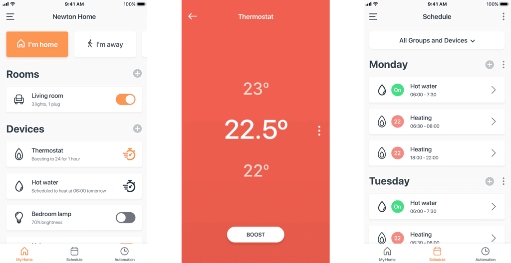
Interaction: Changing temperature

The current gesture of changing your heating temperature is very reserved to a small interaction percentage of the view. Why not explore and expand the primary interaction of the design to something way more accessible to the user?
