Expanding user mental models in onboarding for growth
Fat Llama
Description
Fat Llama (Y Combinator S17) is a peer-to-peer rental marketplace which allows people to rent spare items to others nearby, fully insured. The platform provides a cheaper and more efficient solution than buying outright - their mission is to enable people to share and monetise their unused possessions, increasing the efficiency of both the consumer and the planet’s resources.
I joined their growth team whilst the business pursued its Series B funding round, designing across their web, android and iOS products. I worked to advocate for a culture of continuous learning in order to understand more about Fat Llama's current user base and how it could develop. By organising and executing research with users, I helped to define and visualise problems to solve and ideated on UX experiments to meet them whilst keeping business goals in mind to identify opportunities for impact and learning.
To comply with my non-disclosure agreement for Fat Llama, I have omitted and obfuscated certain visual and written information which is confidential within this case study.
The Challenge
✨ Improve user education on Fat Llama's product offering
As part of a growth team at Fat Llama, it's our responsibility to identify opportunities for impact and shipping experiments to learn in order for us to develop our user base as a startup. When joining the team I began to work on addressing areas of the product that we agreed stood out to us as knowledge gaps regarding the current state of the user experience. I wanted to identify areas that we weren't as educated in, so that we could discover pitfalls in the flow or places that we could feel astonished to learn from.
As a growing startup it's important to have a constantly evolving user model with strong feedback loops to aid your team in understanding present user behaviours and if the solution you're collectively putting effort into is solving the value in which they seek to satisfy their motivation.
Satisfying knowledge gaps in the UX with a learning criteria
As part of a strategy to research and understand core flows better, we began speaking to new users who had recently completed their first rental on the platform to understand more around activation in the experience funnel. Working together with my awesome product manager Ziv Reichert 💪 we worked to agree on a learning criteria, questioning what did we need to learn? What did we feel the least educated in? We categorised users from raw data appropriate for our research, wrote the scripts and reached out to users to interview them.
After speaking to 20+ users over the course of only a couple of days, we arrived at a point where we began to feel less astonished and felt satisfied with the results we'd acquired. After summarising these learnings together and with the wider team, we came to the conclusion on certain areas of impact in terms of user pain points in conjunction with our current business goals that would be worth spending time on.
We decided as part of our first initiative that User education was something that we'd need to address across the product.
First impressions and product education
When new organic users completed their first rental, it was apparent that there was a use case misconception with what they believed they could use the product for. Fat Llama is a platform which allows you to access and rent any item you need, from cameras, to backpacks, to a BBQ for the weekend! The business started with professional photographers and videographers to grow from an existing rental behaviour where these creatives would often require new lenses for shoots with the aim of breaking into more mainstream categories away from film & photo downstream.
Fat Llama's main user segments are made of Borrowers (People who use the platform to rent items) and Lenders (People who lend out things to others available for rent).
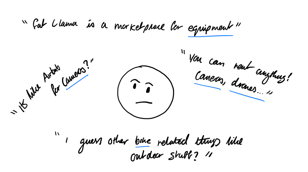
When we asked new Borrowers what else they believe they're able to rent on Fat Llama, a lot of the responses circulated around their original rental, for instance: if a user rented a bike, agnostic of the channel used to arrive on Fat Llama, they believed the platform existed around that specific use case, mentally categorising the product to be an 'outdoors' rental company, and expected to rent other items like tents, and sleeping bags, or other kinds of bikes.
We saw this pattern again and again, attributed to the kind of item that was rented as part of their first time experience. There were an array of aspects around education that we could improve, but to stay lean in our efforts for impact balancing user pain points and our business goals, we decided to work towards the following initiative.
Our hypothesis
✨ By introducing users to the concept of lending and the opportunity to list their item early in the first time experience, we believe that it will invest them into the product faster so that they are able to learn more about wider use cases for renting downstream.
With this approach we were betting on the fact that through this experience, we'd be able to break their initial mental model of what they believed the platform's offering consisted of and in the best case scenario, widen their perspective so that they consider any type of item to be 'rentable', solving both the user problem of understanding what you can use the product for in regards to improving education, and our business goals of improving retention and repeating rentals in order for growth.
The Solution
Evolving perceptions for the mainstream
After our hypothesis was formed, we ideated on a mechanic which could achieve our bet and re-called on an old idea that had circulated the team previously, called 'inventory assessment'.
The process of this was to query the user on things that they had lying around their home, which they could earn money back on by renting it out to others nearby on Fat Llama. After reviewing the overall first time experience across all channels, I set to design a way which this could potentially work as part of the overall product onboarding. We agreed as a team that focusing on new organic sign-ups to the iOS and Android app would be a small enough cohort to validate our experiment but provide enough users for this to be measured with statistical significance.
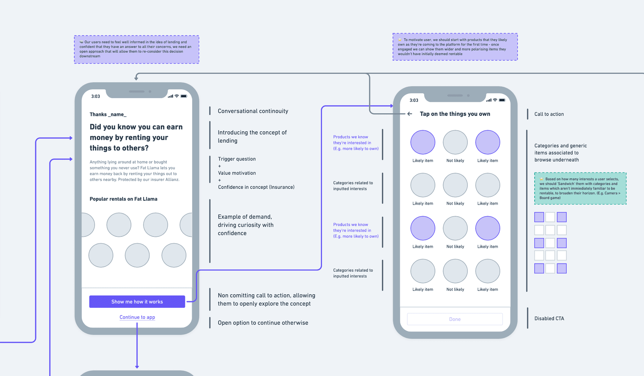
Examples of an early stage wireframe flow
Example of the 'lending introduction' view and the 'assessment' view which follows. Details on how the layout is structured and the thinking process to justify it.
We displayed products across an introductory screen which on-boards the idea of lending an item, and another following screen asking them to select products which they own at home. This is structured in a combination of things that 1) they're likely to own, (informed by search behaviour and our own assessment) and 2) things they're very likely to not own which are way more niche, deliberately for polarisation.
This is used to break familiarity of their mental model and widen their understanding of what is able to be rented on Fat Llama and leave gaps for curiosity and interpretation. We curated a list of 90 products which we wanted to test in the first release which was a blend of these two aspects.
I also set some design goals to help guide the outcome of the design, influenced by our user research.
✨ Depending on the education level needed, help users to understand immediately what Fat Llama is as a platform and what our salient use case is. (E.g. where the user arrives from in the flow and how much they know about Fat Llama)
✨ Help new users to broaden their understanding of what can be rented as their perception of the options most likely circulate around their initial use case.
✨ As a new concept to understand, don't push the idea of commitment - allow them to feel empowered to explore this idea on their own and make the incentives of this exploration clear.
✨ Guide users to pick at least 1 item, as this hopefully will let them find relevance in what they can rent and hopefully connect the dots with the motivation that they can make money.
Putting ideas into action
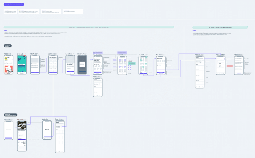
I put together a really simple prototype using Figma with the motivation of putting it in front of people who weren't aware of Fat Llama as soon as possible, to test our pre-requisite goal of building this feature for organic sign up users.
This is a combination of current app onboarding including the new 'item inventory assessment flow'
After running through the feature with users we picked up on a couple of highlight points which were really interesting.
We used an image of a backpack which elicited this response "Who would rent a backpack? Hmm weird, but ok" from one of the participants. This was a success for us, as we came to see how someone was faced with an item they didn't believe they could rent and furthermore expanded their expectation.
From using our prototype, 2/3 of our participants were able to think of a product that they owned at home and realised that it's something they were able to rent which was a huge win.
We also realised that through our research that the prompt 'Anything lying around at home?' within the description creates this moment where the user takes a second to do a mental scan of their home, starting with one of their favourite rooms. Some participants either navigated directly to a main object like shelving, or a related room next door in order to continue this 'scanning' motion, but we realised we were onto something interesting with our goal of expanding use cases.
Empowering prompts with a visual trigger
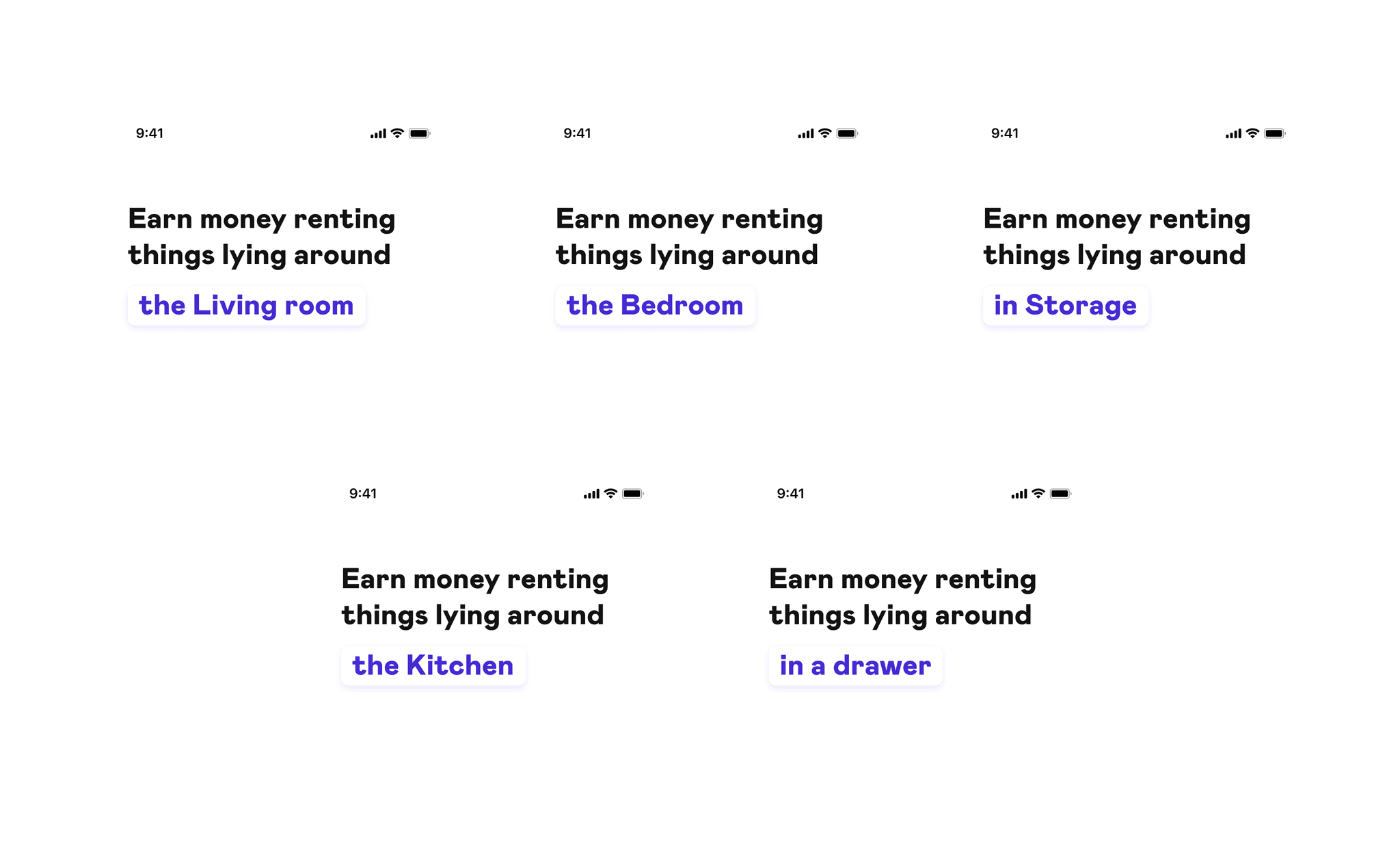
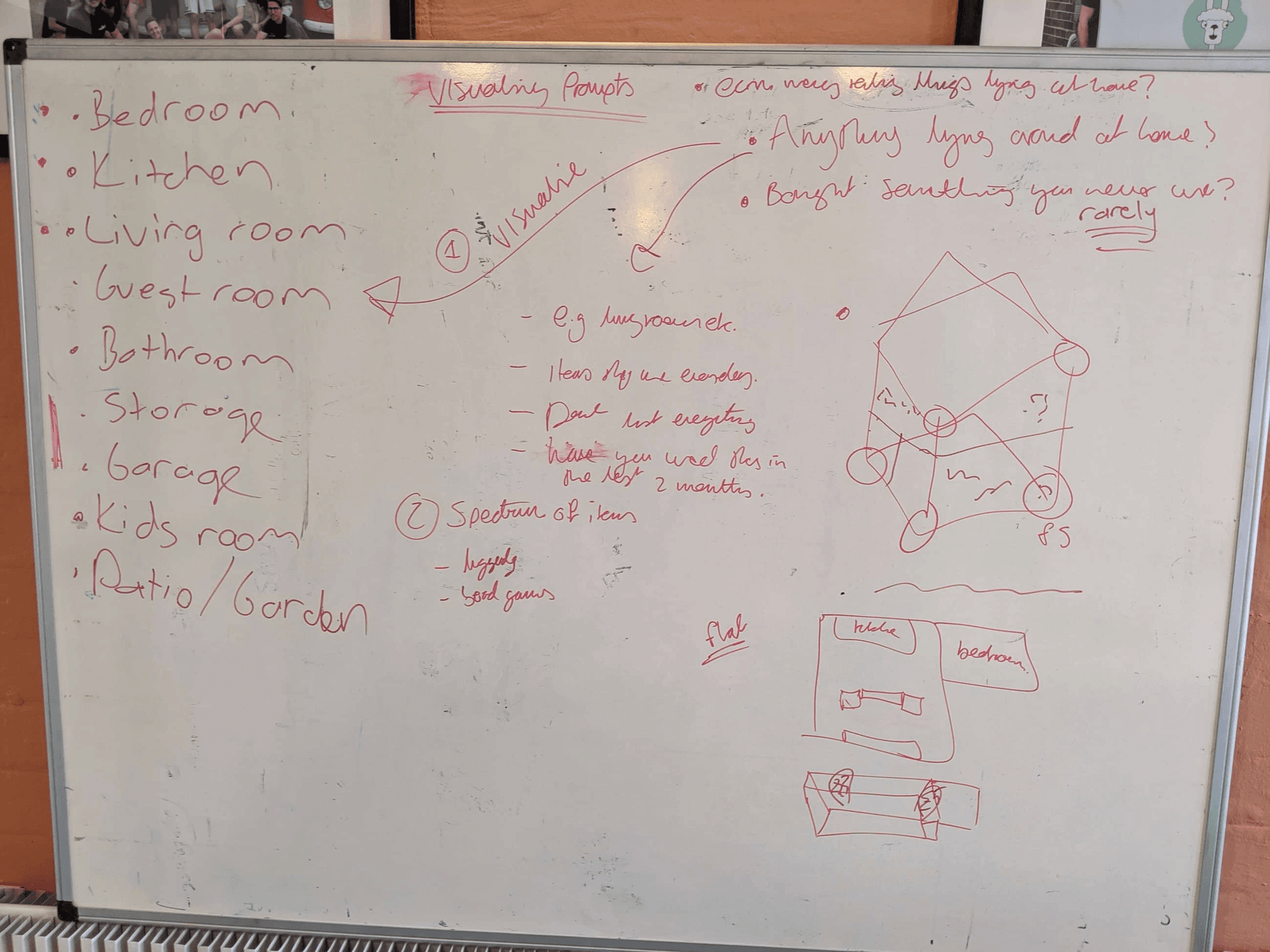
From this insight, I further ideated on an iteration that could amplify this prompt with an idea to visually animate and cycle through an array of rooms in a home, to help sustain the 'mental scanning' mechanic.
We also thought that a strong visual of the home in this screen would help to influence the chance of this mental routine occurring for new users.
Whiteboard ideation of the onboarding flow and how we can widen the perspective for users
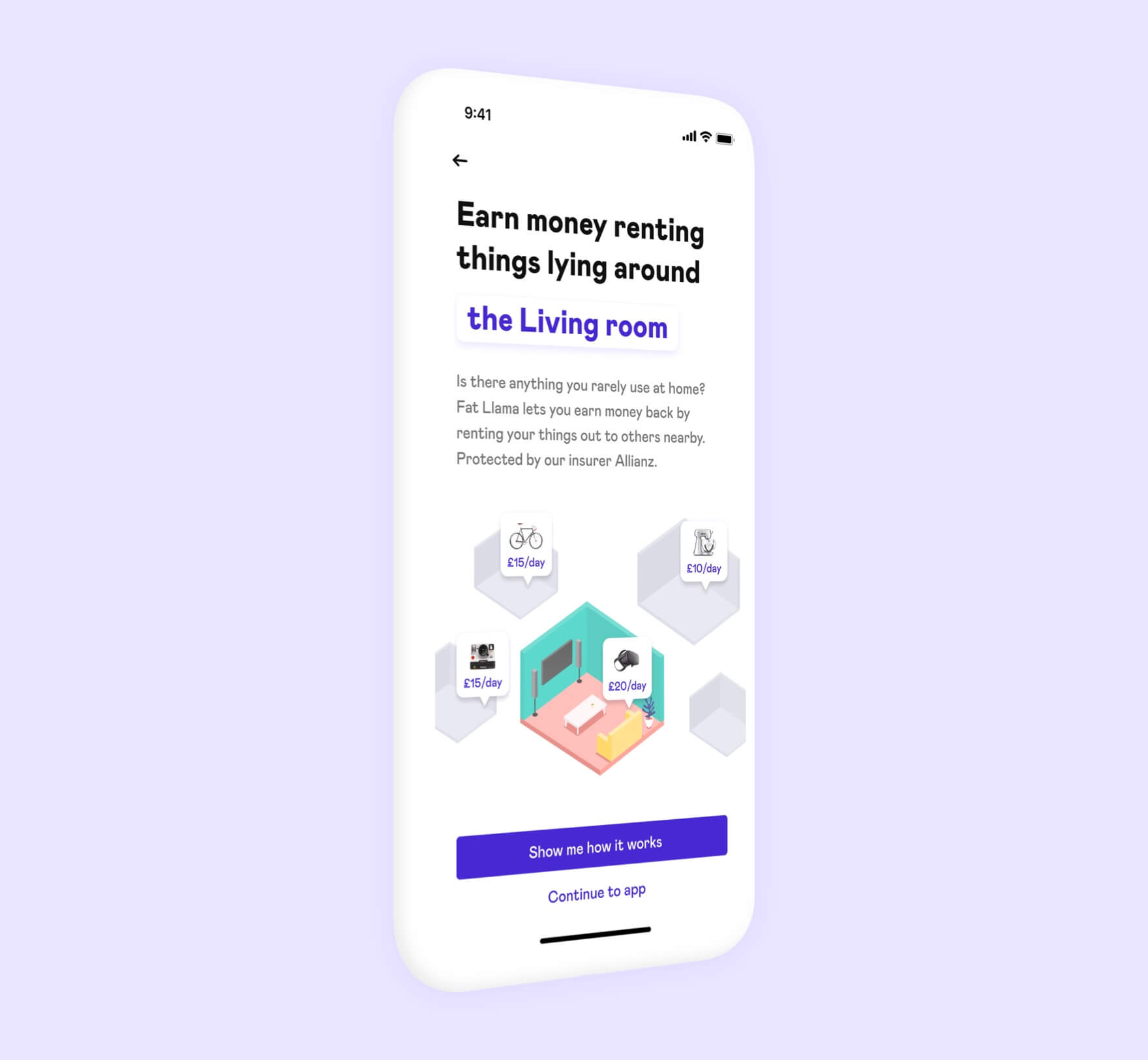
✨ The final design
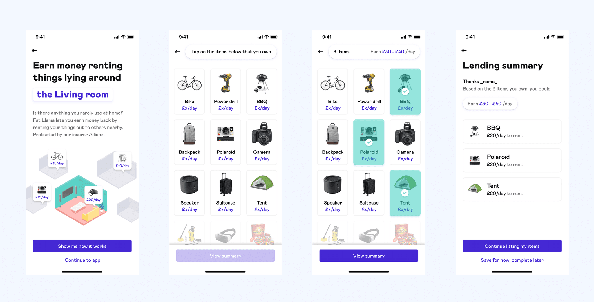
The final core screens for the item inventory onboarding flow
I reached out to Oliver Albury, one of the talented designers in our team to pitch in with his awesome illustration skills and it's safe to say that he killed it! The whole composition came together perfectly and was exactly what we were looking for in order to invoke our prompt successfully.
Sacrifices along the way
One feature that was considered in the scope was the ability to search for an item which you may own if you're not able to find something which you may have thought of on your own. Whilst upfront this seems like a key thing to develop based on our prompt notion, we believed that the important part of this feature was the way we broke familiarity in the users mental model.
The ability to recognise and engage with the idea of listing an item is definitely part of our goals, but it was secondary to the success of this implementation. We held it back, keen to see and learn how behaviour is moulded by this feature downstream in interviews and quant data from first time usage.
Measuring success
Due to my NDA I'm unable to discuss entirely how we measured for success. However I can say that 2/19 first users to engage with this feature on the day of its release, resulted in listing an item available to rent on the platform. This is a huge first step for our success criteria.
🛶
Special thanks to Emre Ergin, Gürhan Mermer, Martine Ehrlich, Sebastien Canellas-Guille and Oliver Albury. It was a pleasure to work with you guys and your creative collaboration to building this awesome work.
Thanks for reading! If you'd like to reach out to me and want to know more about this project, or simply just have an open conversation about design you can hit me up at hello@joshua.design, or tweet me @joshuanewton1
